Reading Food Inflation Data: What The Numbers Actually Mean
Government reports publish inflation figures regularly. Here’s how to interpret them and understand what they mean for your wallet.

Why Inflation Numbers Matter
When the Reserve Bank of India releases inflation data each month, most people glance at the headline number and move on. But here’s the thing — that single percentage tells you far more than it seems. It’s the difference between understanding why your vegetable bill jumped 15% last month versus feeling completely blindsided at the market.
Inflation data doesn’t just appear in government reports. It’s the foundation for policy decisions, interest rates, wage negotiations, and your household budget. Yet many of us read these numbers without actually understanding what they’re measuring or how to use them.
You don’t need an economics degree to make sense of inflation data. You just need to know what to look for, how the numbers are constructed, and what they reveal about your everyday costs.

What’s Actually Being Measured
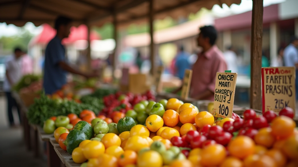
The Consumer Price Index — or CPI — is the standard tool for measuring inflation. It doesn’t track every single product sold in India. Instead, it measures price changes for a specific basket of goods that an average urban household actually buys.
This basket includes food items (about 46% of the weight), fuel and light, clothing, housing, health, education, and miscellaneous goods. Each category gets a specific percentage weight based on how much the average household spends on it. When onions become scarce and expensive, that has a bigger impact on the CPI than when car prices change — because more households buy onions.
Think of it this way: if your household spends 50% of its budget on food, then food inflation will drag your overall inflation reading much higher than if you spent only 20%. That’s exactly how the CPI basket works. It’s weighted to reflect real spending patterns.
The CPI basket changes every few years to reflect shifting consumption patterns. What mattered in 2015 doesn’t necessarily matter the same way in 2026.

Headline vs Core Inflation
When you see “inflation at 5.8%” in a news headline, that’s typically headline inflation. It includes everything — food, fuel, all of it. But here’s where it gets interesting: food and fuel prices are volatile. A single monsoon delay or oil price shock can swing the headline number significantly.
That’s why central banks also watch core inflation, which strips out food and fuel. Core inflation moves more slowly and reveals underlying price pressures in the economy. When the RBI makes interest rate decisions, they’re looking at both numbers but paying close attention to core inflation because it’s more stable and predictable.
If you’re trying to understand the economy’s real direction, don’t just look at the headline number. Check whether headline inflation is high because of temporary food price spikes or because underlying price pressures are building across the board.
How to Actually Read the Data
When the RBI releases monthly inflation data, you get several numbers. Here’s what each one tells you:
Year-on-Year Change
This compares prices this month to the same month last year. It’s the number you’ll see in headlines most often. A 5.2% YoY reading means goods cost 5.2% more than they did 12 months ago.
Month-on-Month Change
This shows how prices moved from the previous month. It’s more volatile but helps you see seasonal patterns. Vegetable prices often rise in winter months, for example.
Food Inflation Separately
Food typically moves independently of other prices. A 12% food inflation reading combined with 3% non-food inflation tells you the cost-of-living pressure is concentrated in groceries.
Category Breakdown
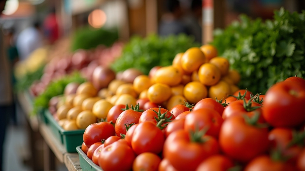
The detailed tables show which categories are driving inflation. Vegetables might be up 18%, but cereals only up 2%. This tells you where your budget’s being squeezed hardest.
Spotting Seasonal Patterns
One of the most useful things about tracking inflation data over time is recognizing patterns. Vegetable prices spike predictably. Monsoon delays cause specific categories to rise. Post-harvest periods bring relief.
If you look at 12 months of data instead of just the latest month, you’ll notice that March and April often see higher food inflation due to monsoon uncertainty. June through August typically bring relief as the new harvest comes in. This isn’t random — it’s agricultural reality built into price movements.
Once you understand these patterns, you can anticipate where your household budget will face pressure. You’re not surprised when tomato prices double in March. You’re not caught off guard when onion inflation hits 25% in February. You see it coming and adjust your spending or plan your meals differently.
“Inflation isn’t a single number — it’s a story about what’s happening in farms, markets, and supply chains across the country. When you learn to read it, you understand your economy better.”
— Understanding Price Movements


Putting It Into Practice
So how do you actually use this information? Start by tracking your own household spending on food categories for 2-3 months. You’ll discover what percentage of your budget goes to vegetables, pulses, milk, cereals, and other staples. This is your personal CPI basket.
Then, when inflation data comes out, focus on the categories that matter most to your household. If you spend 30% of your food budget on vegetables, a 15% vegetable inflation reading has much more impact on you than on someone whose diet is based on cereals and pulses.
Compare year-on-year numbers, not month-to-month. Monthly movements are noisy. When you look at where prices were 12 months ago, you see the real trend. If your grocery bill went up 8% over the past year but food inflation is reported at 6%, you’re paying more than average — either because you’re buying premium products or because you live in a high-cost area.
Finally, don’t just read the headline number. Dig into the category breakdown. Understand what’s driving the overall figure. Is it temporary food inflation or persistent pressure across the board? That difference matters for your household planning.
Understanding Inflation Empowers Your Budget
Inflation data isn’t abstract economic theory. It’s the story of what’s happening in the markets where you shop, the farms that feed your family, and the supply chains that determine whether vegetables cost 30 per kilogram or 60.
When you learn to read this data — when you understand the difference between headline and core, when you spot seasonal patterns, when you translate national figures into your household reality — you stop being a passive observer of price changes. You become someone who anticipates them, plans around them, and makes smarter spending decisions.
The next time inflation data is released, don’t just check the headline number. Go deeper. Look at food versus non-food. Check which categories are driving the movement. Compare it to last month and last year. Your wallet will thank you.
Explore More on Food Inflation
Ready to dig deeper into how food prices work in India? Check out our related guides on seasonal patterns, supply chain economics, and household budget tracking.
Disclaimer
This article is educational material designed to help you understand how inflation data is constructed and interpreted. It’s not financial advice, and individual circumstances vary significantly. Inflation impacts different households differently depending on their spending patterns, income sources, and geographic location. For specific financial or budgeting decisions, consider consulting with a financial advisor or economic professional familiar with your local market conditions. The data patterns and examples described here are illustrative of typical trends but shouldn’t be treated as predictions or guarantees.
Related Articles